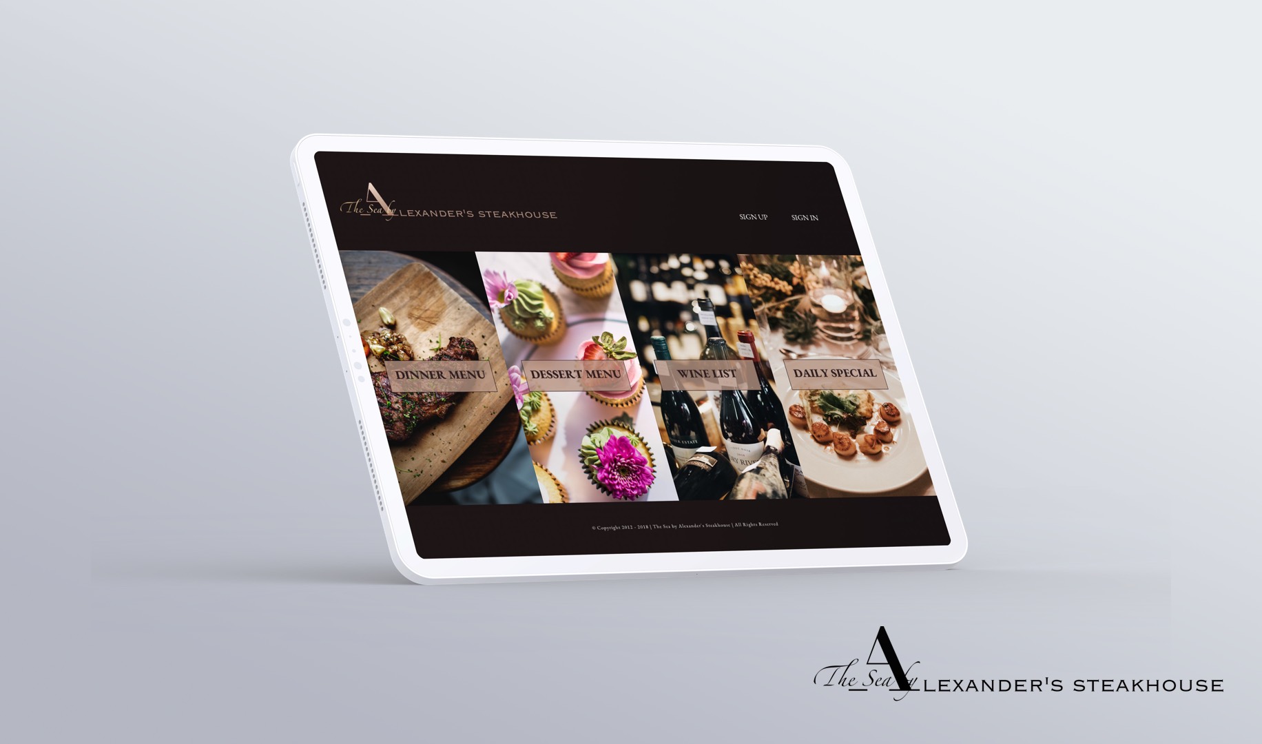
The Sea by Alexander's Steakhouse
Branding Design
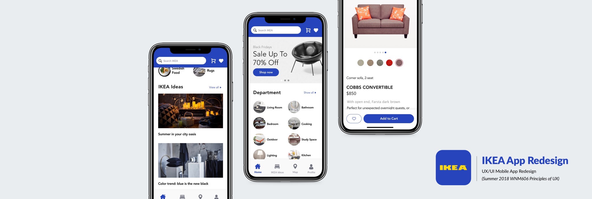
IKEA store app is intended to improve the online shopping experience. The redesign concept will ensure a smooth and simple transaction for the customers. The app will offer easy navigation and recalling your purchase and favorite items. This is the perfect shopping companion.
My goal is to improve and redesign the IKEA customers’ shopping and searching experience. First, by prioritizing the information hierarchy to allow the user interface more intuitive to the users’ normal behavior. Second, I will add a check-out feature for app purchases, currently the check-out feature is available only through laptop not smartphone purchase.
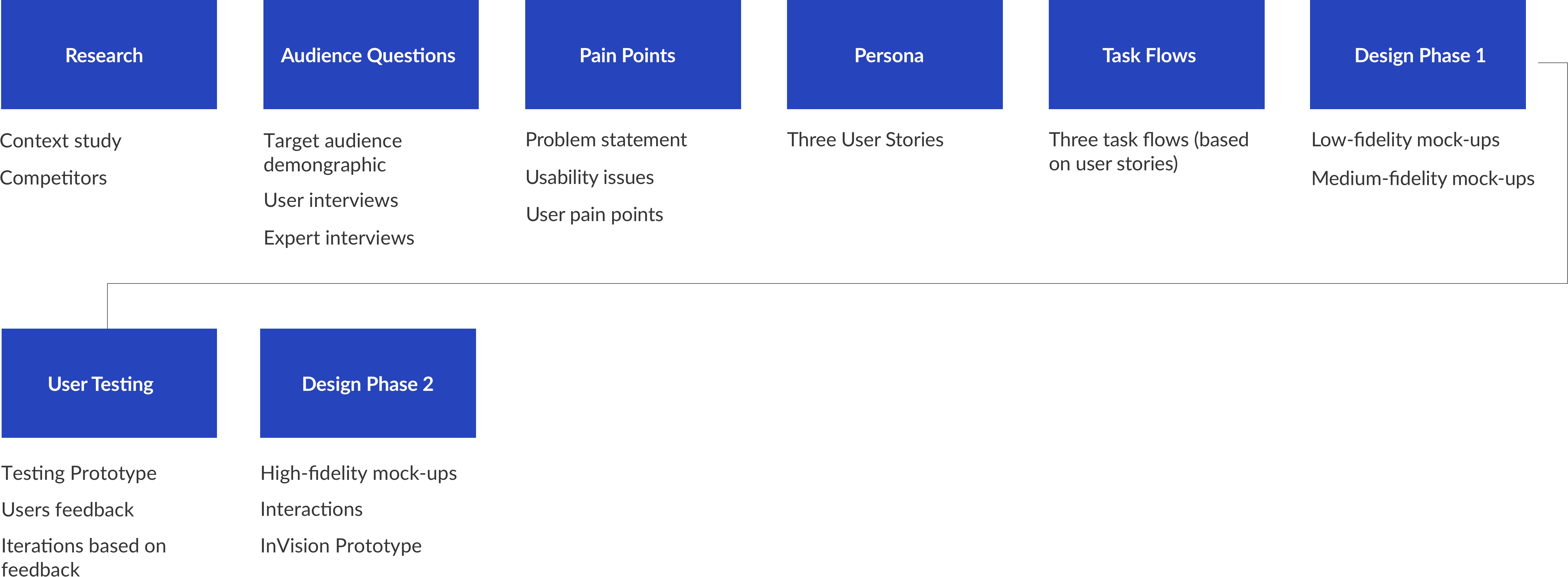
To better understand users' experience, I conducted in person and phone interviews with Ikea users. The interview consisted of loyal Ikea customers as well as occasional shoppers. My main goal was to understand how frequently customers use the app to purchase products vs in store shopping. The data is shown on the right on post notes.
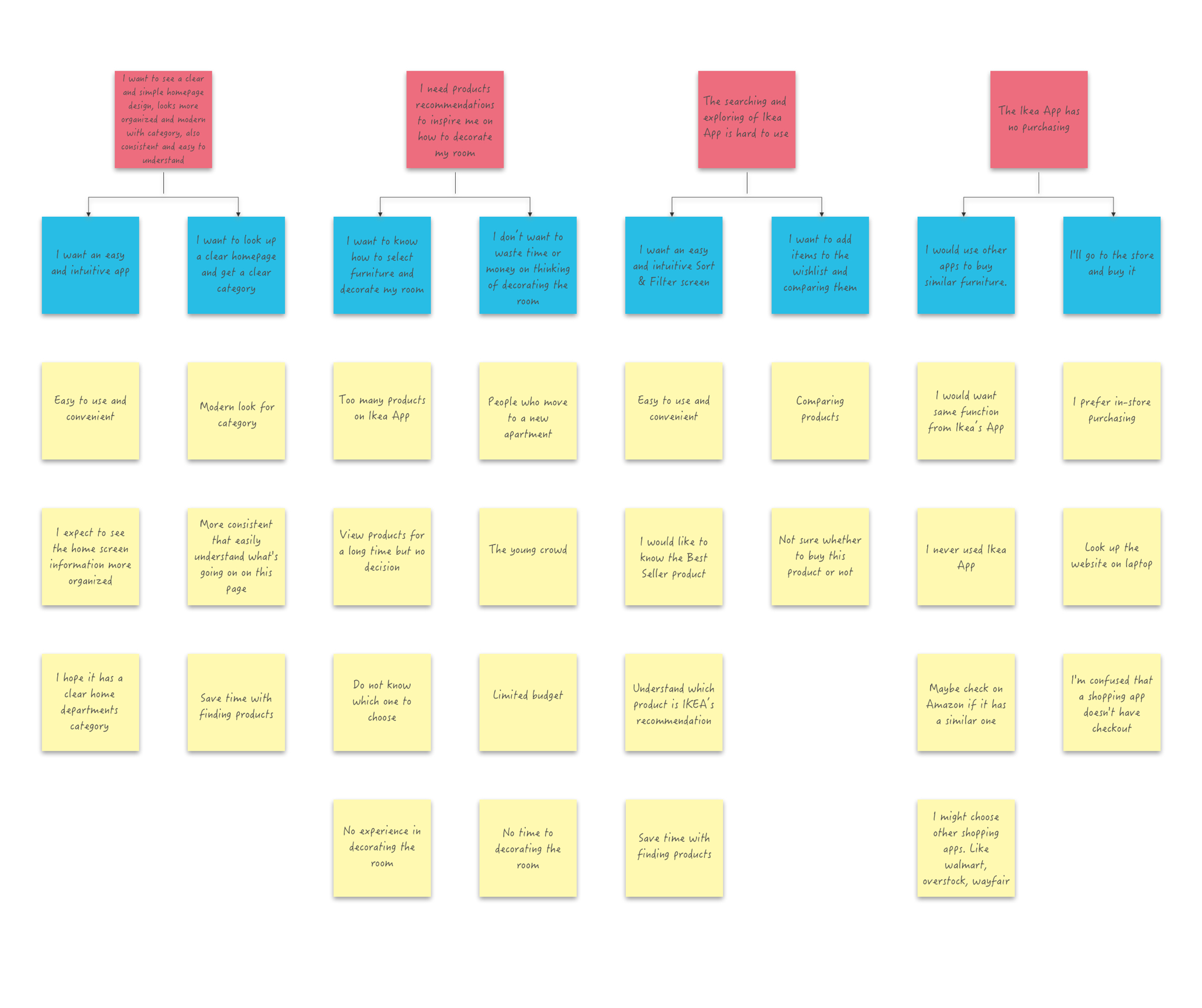
For the interviews, I asked questions regarding 3 general categories: Their background profile, shopping experience with Ikea, and feedback on the current app. To empathize with the shoppers, I mapped their journey from beginning of their shopping to the purchase. With their information, I was able to discover the pain points on the Ikea current app. This was the process of how I identified the problem with the original Ikea app.
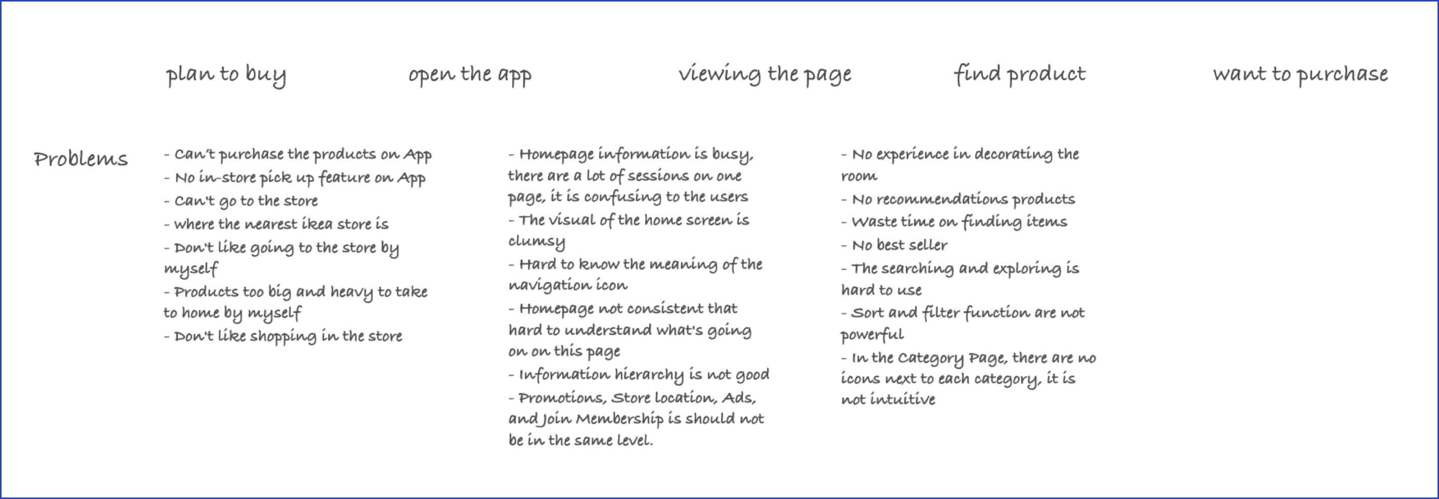
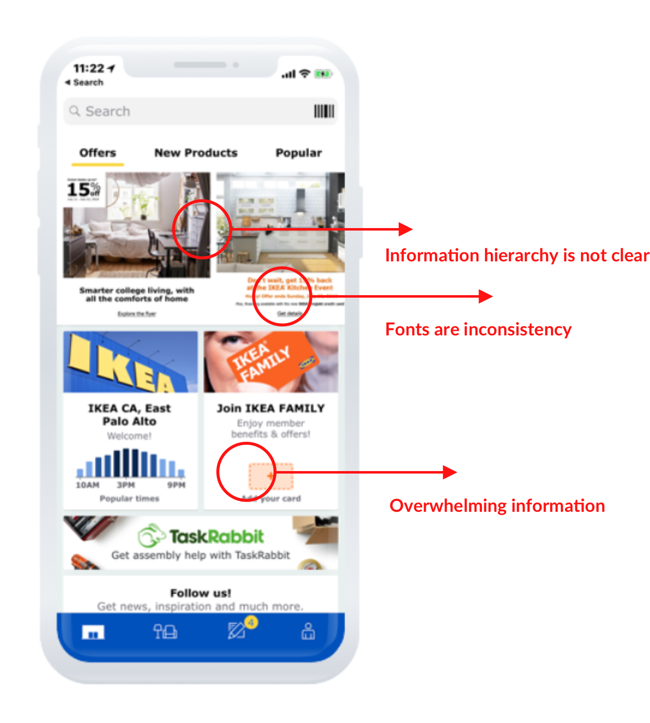
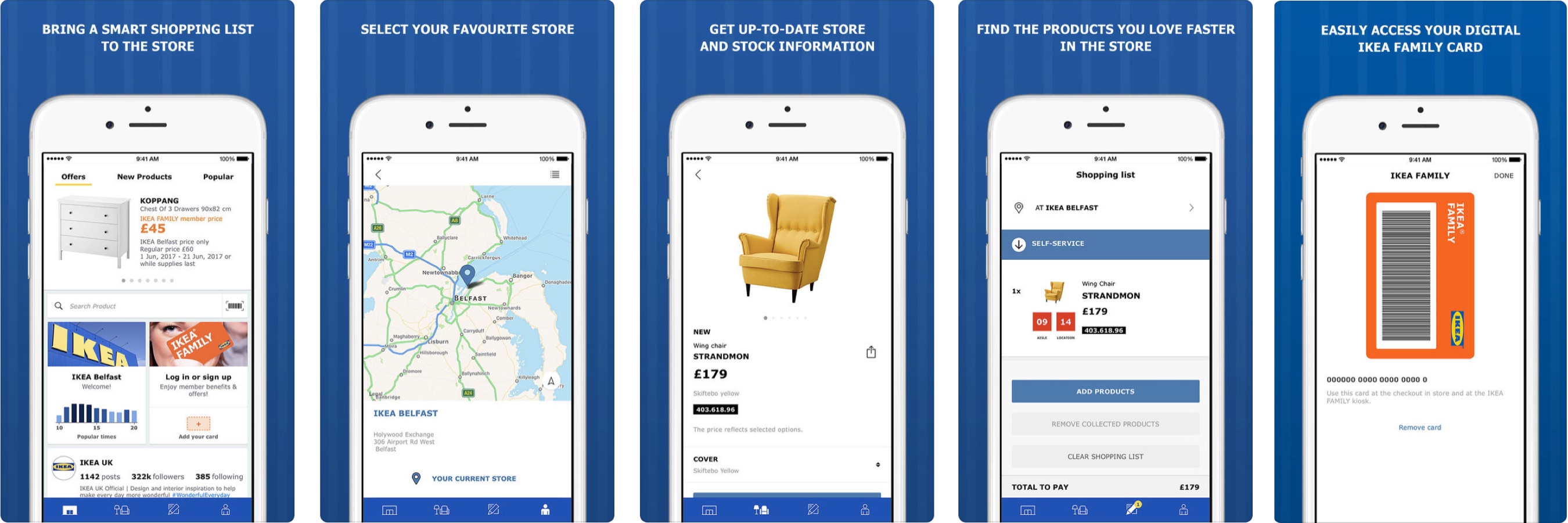
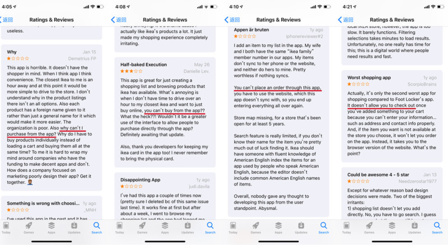
The current home-screen is too busy. It contained too much information like Promotions, Store location, Ads, and Join Membership option. This makes users feel overwhelmed. The information hierarchy is not clear, so it is confusing for the users to not know where to begin with the app. From the visual design perspective, the UI is outdated, and the fonts are inconsistent.
I asked 15 people what the first thing they want to do on the home-screen? 12 out of 15 respondents want to search for furniture. For example, they said, "I want to search for furniture." Other respondents said, "I want to know the most popular furniture and promotions." The current home screen UI doesn't align the user's needs. The information is very scattered.
Searching experience is essential to an e-commerce website or App according to zyxware.com
In an average of eight seconds visitors decide whether or not to remain on a site.
43% of visitors immediately go to the search box, and these searchers are 2-3x more likely to convert than non-searchers. 50% of users prefer to use a site's internal search engine, as opposed to navigating its site.
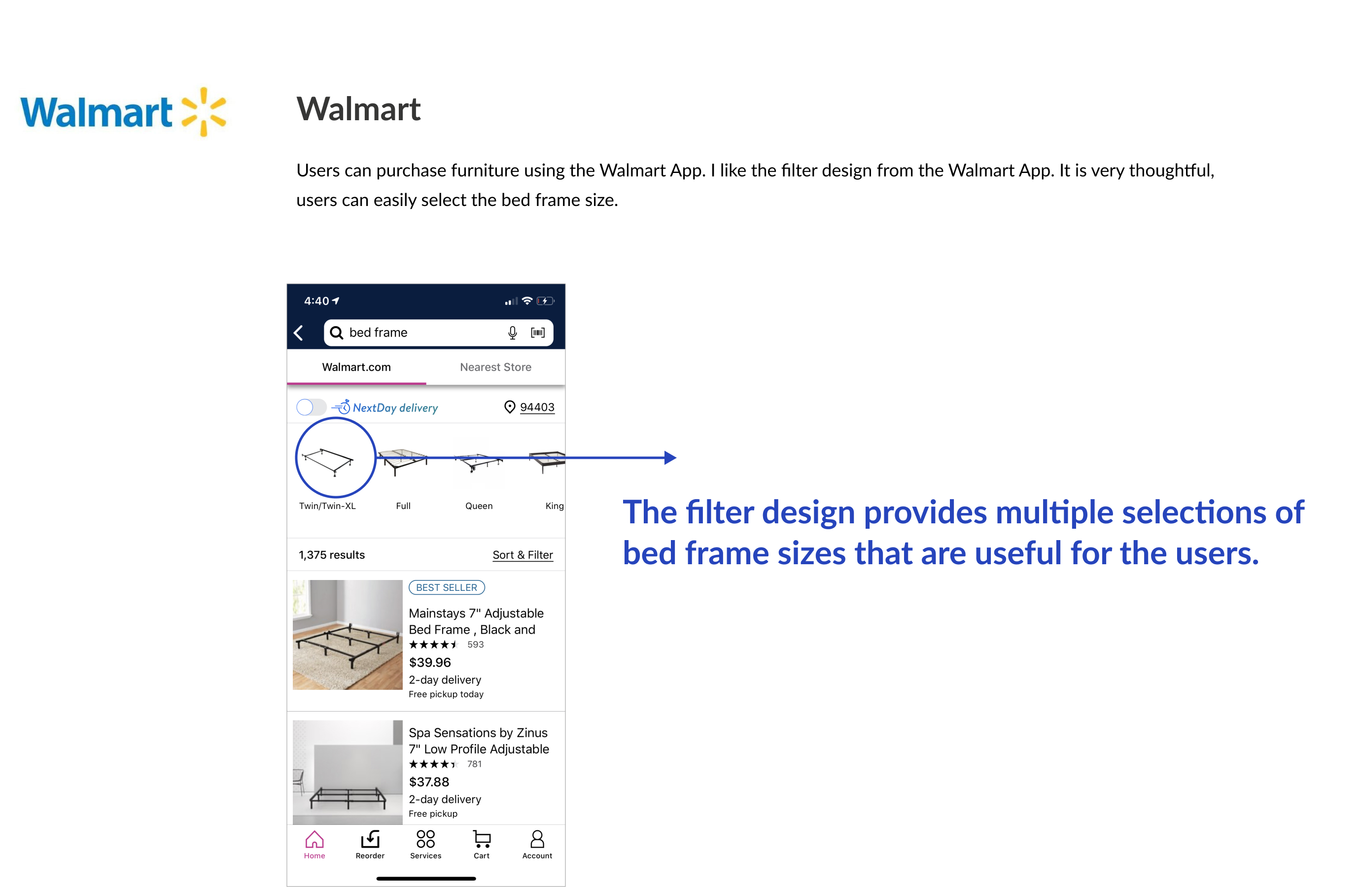
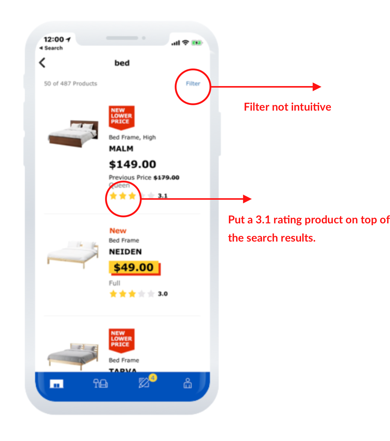
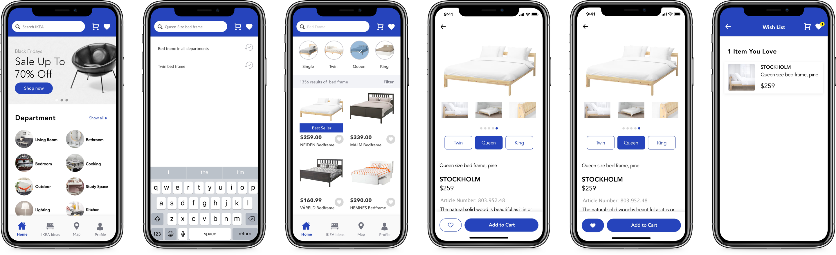
The current searching experience is not user-friendly. For example, if a user searches "Bed." It will display all the bed sizes lump together like Twin, Full, King. In the filter, it doesn't give you the option to select the size. Users have to type "Queen size bed-frame manually." Secondly, it doesn't show which product is the best seller or highest reviewed. Users have no idea which one has a better quality over the other. The current list shows only three products in one screen, which is limited. On a smaller size screen like iPhone 5, it only displays two products.
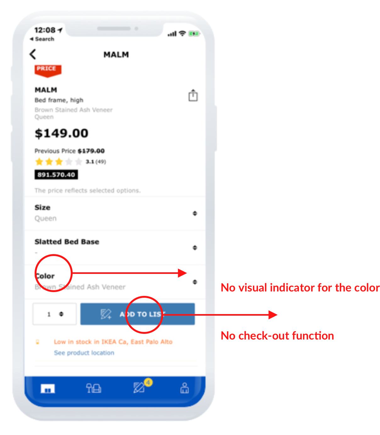
Based on my research, I found out that you can not order furniture through the IKEA App. Many respondents complain in their questionnaire. Also, adding the check-out function is the most frequently asked feature from IKEA users. Without a “check-out” function, users are frustrated with spending time viewing their products to find out they can not buy it. To them, it is a waste of time and negatively impacts their experience.
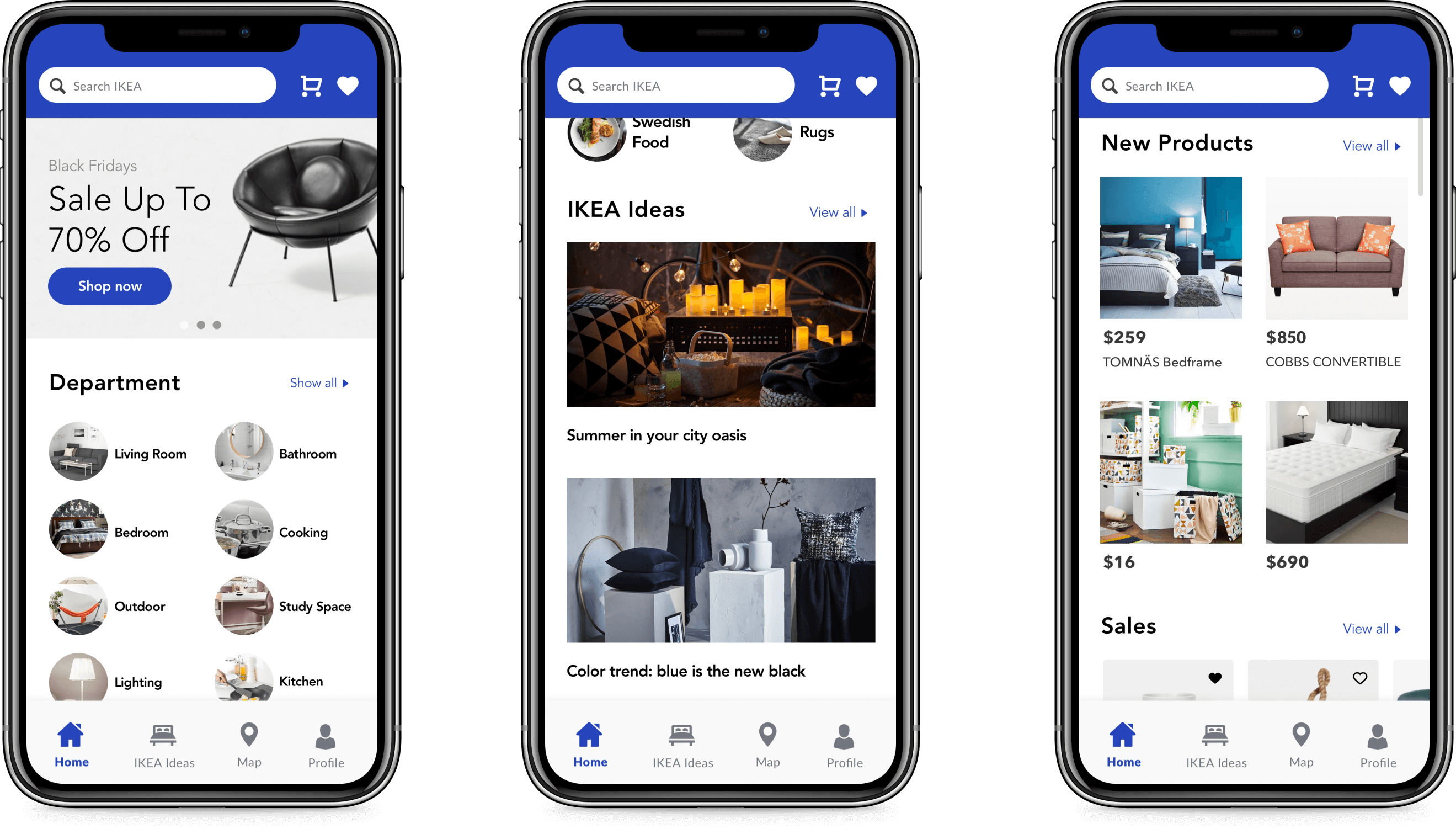
Improve home screen information hierarchy. The current homepage information is very busy, there are a lot of various themes on one page, it is confusing for the users. I will provide a strong hierarchy for the page. Additionally, I will add a new feature called “IKEA Ideas” to inspire the users to select furniture and decorations on current interior designs.
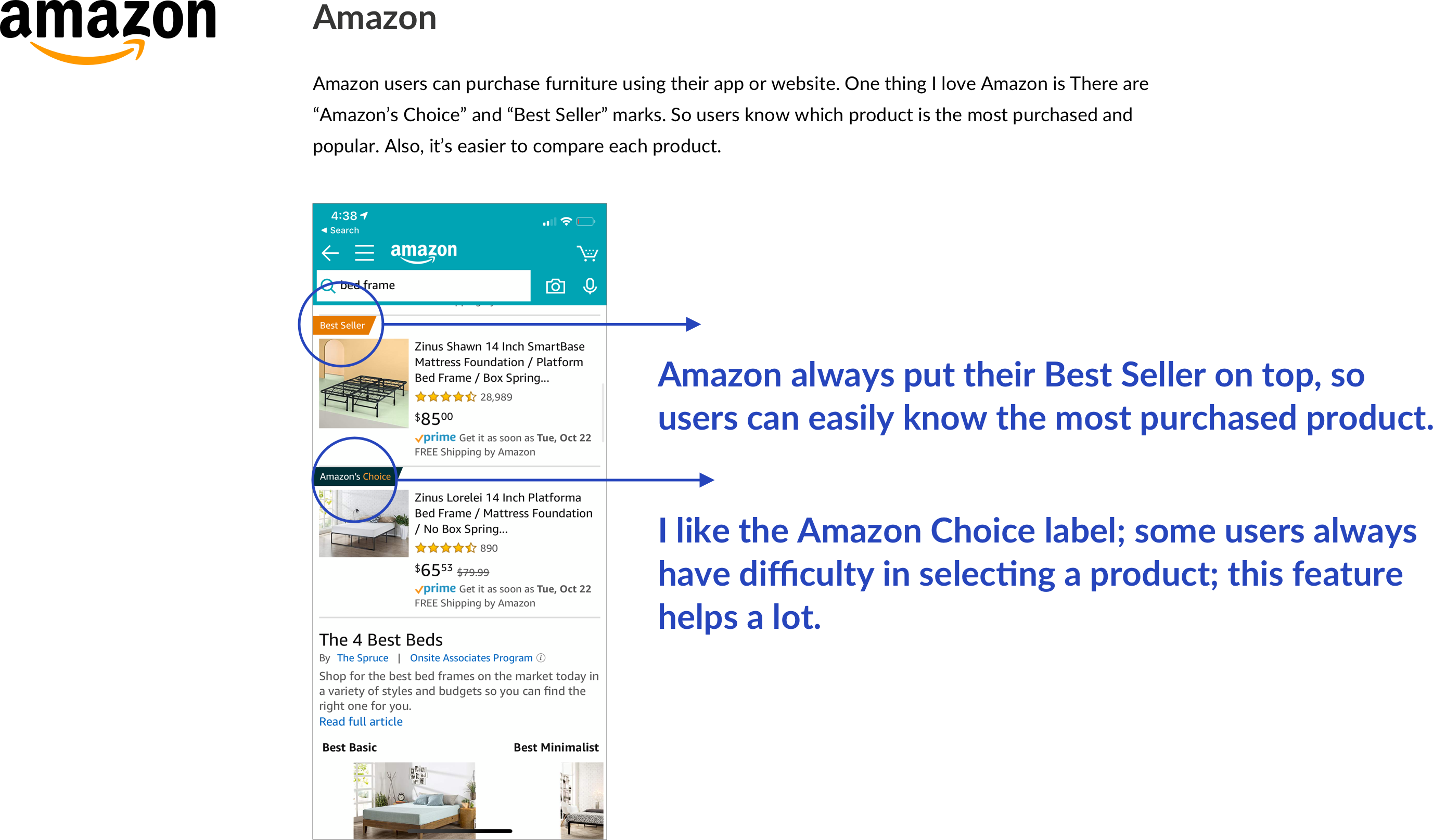
Improve search and explore product experience. (Sort & Filter part redesign). I redesigned the Sort & Filter screen to be more intuitive to the users. For example, adding the “Best Seller” mark will allow users to understand the products that are the highest sellers from Ikea.
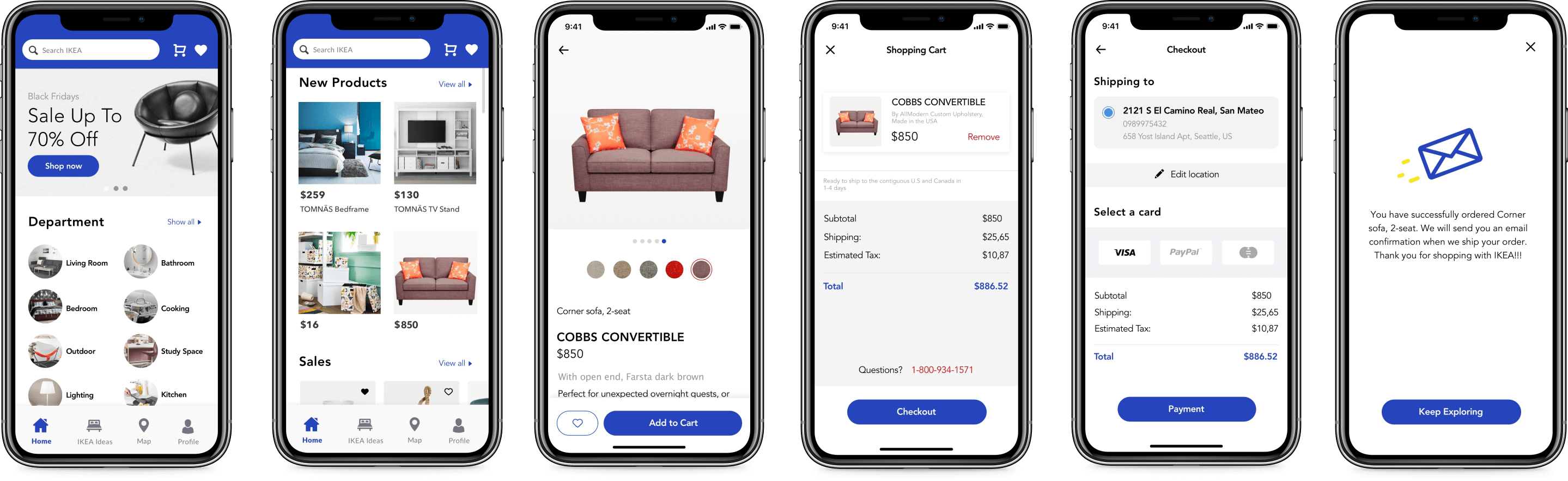
Add “Check Out” and “In-Store Pick Up” features. Referring to the user's questionnaire, we will add these two functions to solve their frustration. The “Check Out” feature answers users' concerns of “Can't purchase the product on app.” “Don’t want to go into the store”, or “There is no Ikea store near me.” Other users have said, “I Don't like shopping in the store” or “Waste time on finding items in the store.”
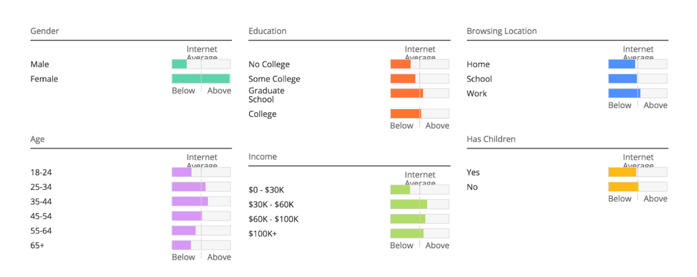
From Alexa.com, I gathered a set of useful demographics data on users who visit Ikea.com. Primary Target Audiences are Female, the user age group from 25 to 44. The majority of the Ikea website user's income range is between $30K-$60K.
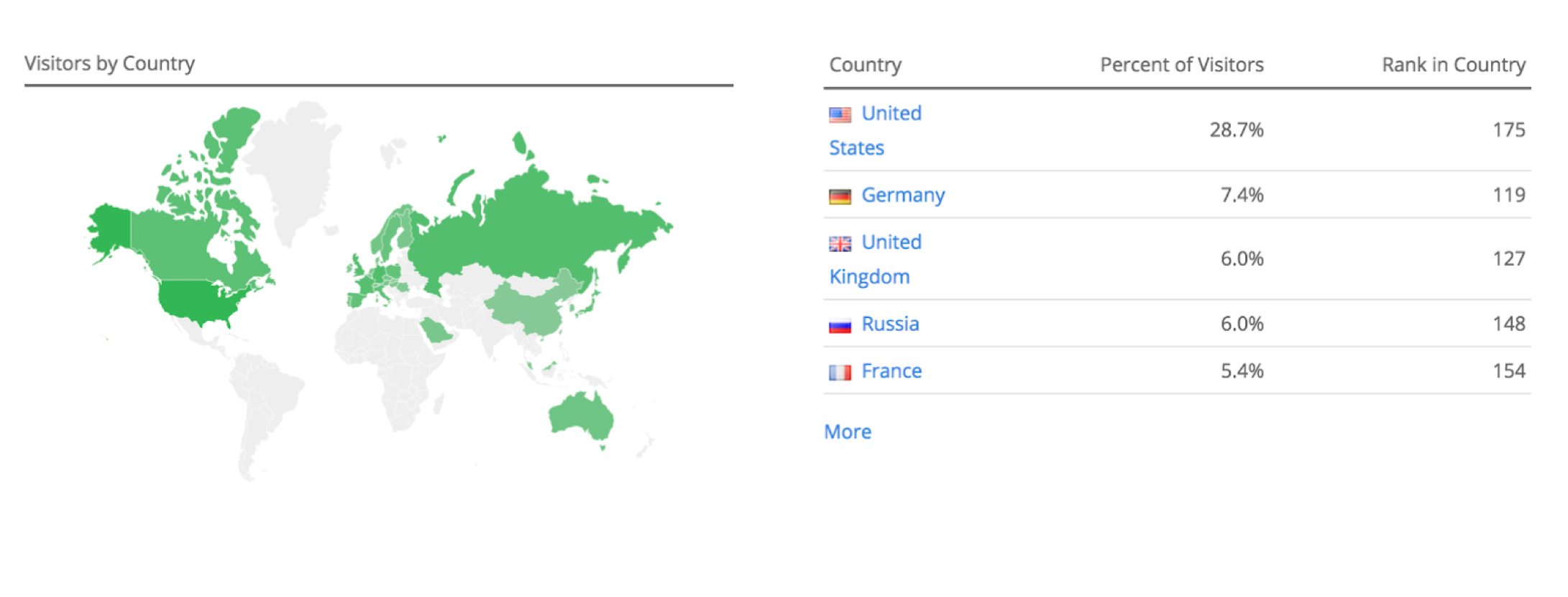
The results showed the most Ikea site visitors located are in the United States.
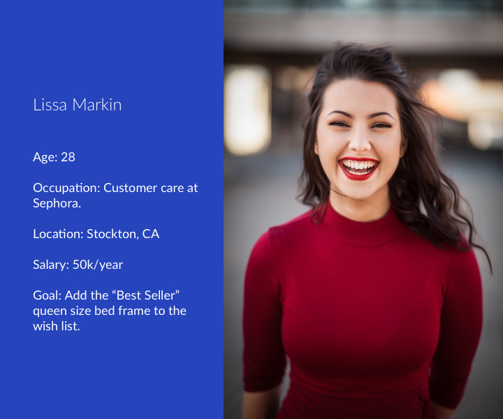
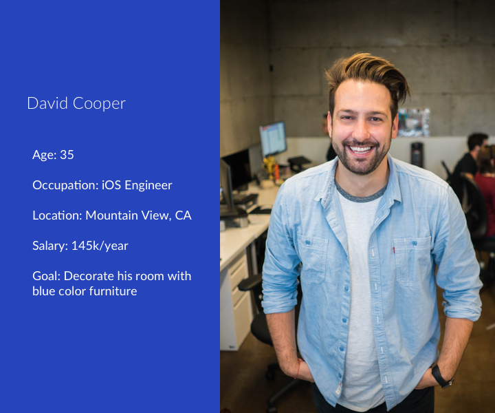
"I plan to move to a new apartment. I want to start looking for a queen size bed frame, so I download the IKEA Store App."
Lissa is the customer care at Sephora. She is going to move to a new apartment with his boyfriend, John, in October. She plans to buy a new queen size bed frame.
She downloads the IKEA Store App at home. She opens the app and land on the home screen. She taps “queen size bed frame” in the search banner. It shows 1356 results of queen size bed frame. She sees the one with the “Best Seller” mark on it. She taps the image to go to the detail page. She read the detail information and decides to add it to the wish list. So she taps the heart icon to add it to the wish list.
"I want to learn how to decorate my living room. So I download the IKEA Store App to use IKEA Ideas feature to read "Color trend: blue is the new black" article."
David is an iOS engineer who works at the mountain view, CA. Recently, he just moved to a new apartment. He wants to decorate the room with some blue furniture and want to get some inspiration.
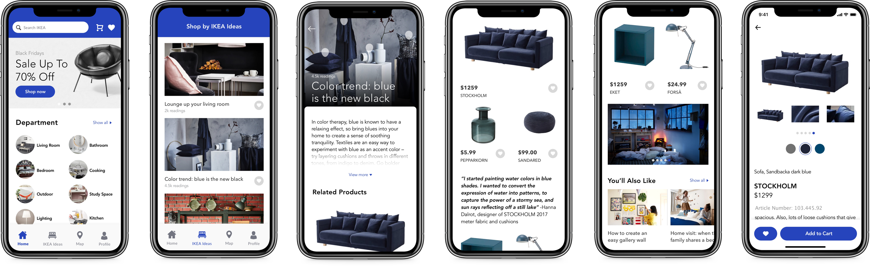
David downloads the IKEA Store App. He opens the App, and then he lands on the home screen. David scrolls down to views more content on the home screen. And he finds the IKEA Ideas session. After that, David taps the "view all" button. There are 340 articles in the IKEA Ideas. He reads, "Color trend: blue is the new black" article. He read the content and related furniture. He taps the Stockholm sofa. He likes it. Now, David gets the inspiration on how to decorate his living with blue color furniture.
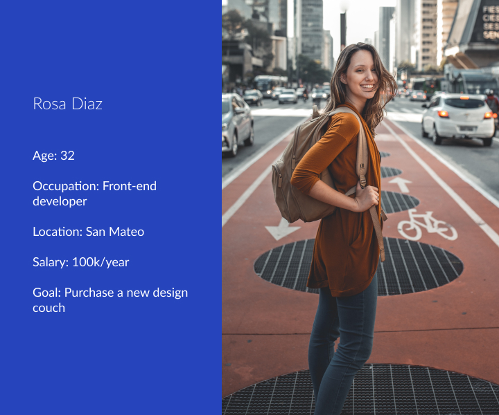
"I want to buy a new design couch. So I download the IKEA Store app to use the “Shop by new products ” feature to find a new design couch and purchase it."
Rosa is a Front-end developer who works at San Mateo. Her old couch broken last week. So she decides to purchase a brand new couch.
She downloads the IKEA Store App when she at work. She opens the app and land on the home screen. She starts scrolling down to view more content. Then she saw the COBBS CONVERTIBLE under the “Shop by new products feature.” She taps the image to go to the description. She likes the design of the couch, and she taps the “Buy Now” button to purchase it. She puts her credit card information and fills the shipping address. She taps the “Submit Order” button. Then she receives a confirmation message.
Starting with low fidelity mock-ups can help me quickly figure out if people have some difficulty with the flows. Also, I can have some early ideas how the layout look will. After the user testing and make sure users don’t have problems with the layout and content. I start designing the high-fidelity mock-ups.
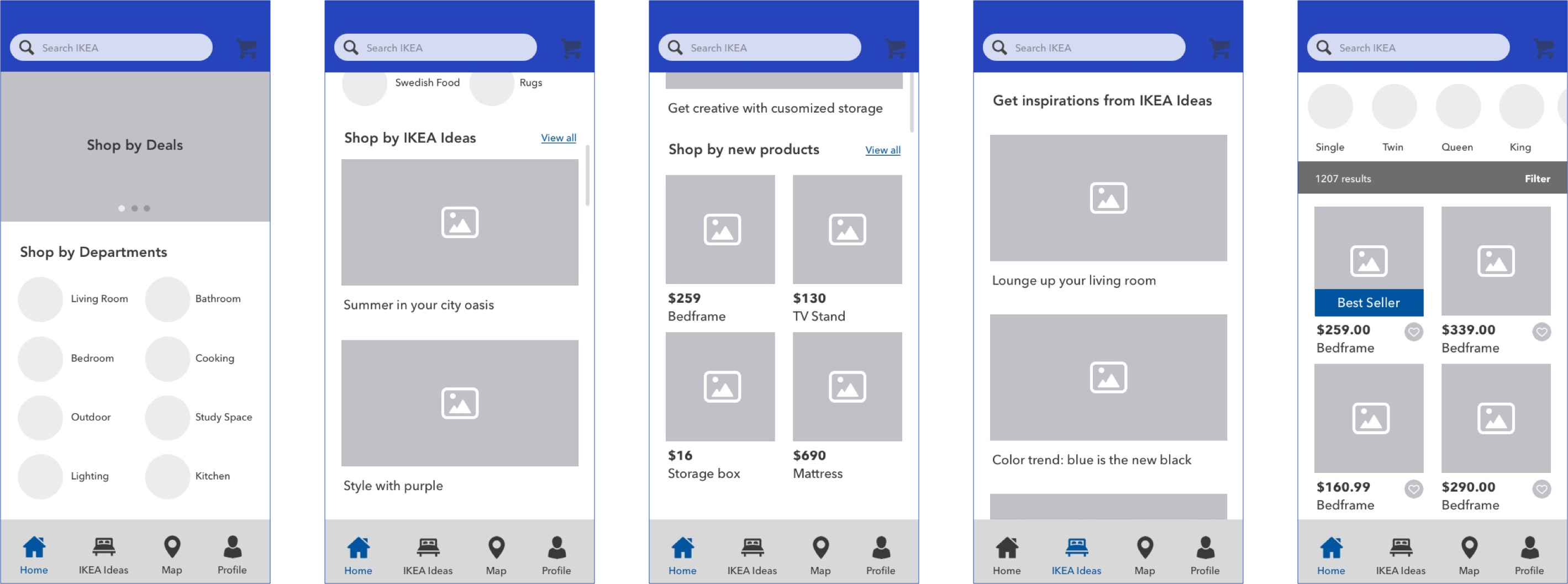
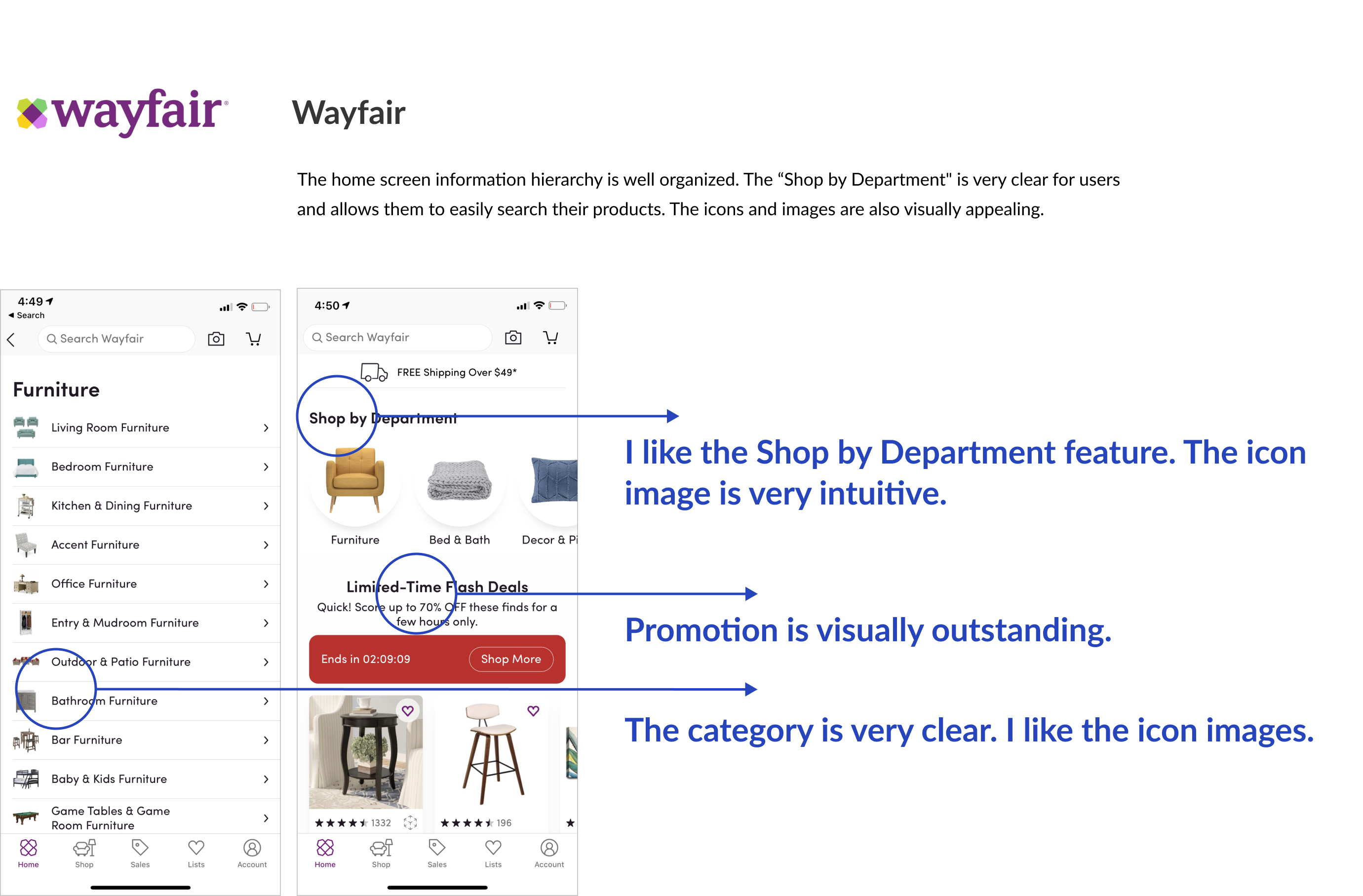
Redesign the homepage layout and focus on improving the information hierarchy. The research shows that when users land on the home screen, the first thing they want to do is viewing the furniture. There are four major sessions in the home-screen. Users can choose to “Shop by Department”, “Shop by IKEA IDEA”, “Shop by Deals” and “Shop by New Products”. In this way, the users can quickly navigate to the furniture they want.
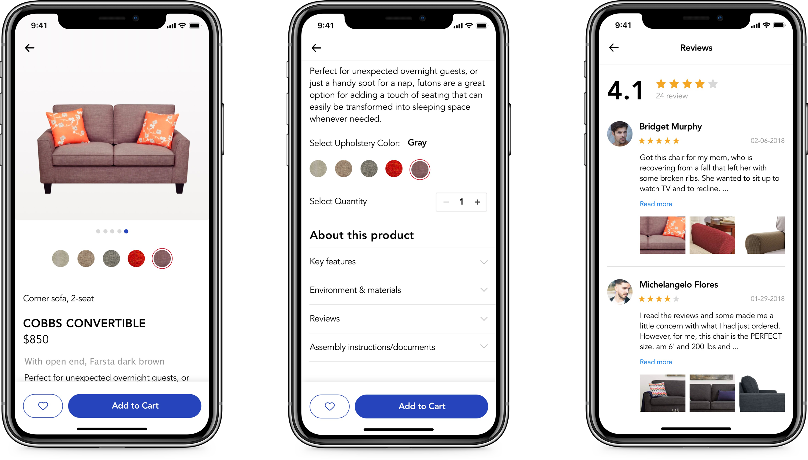
Redesigned object detail screen is visually more appealing and modern. I increase the copy font size to 17pt since some older people complain the current copy size is too small. The Add to Cart CTA button will be fixed. So users can always easy to tap the CTA to buy the product.
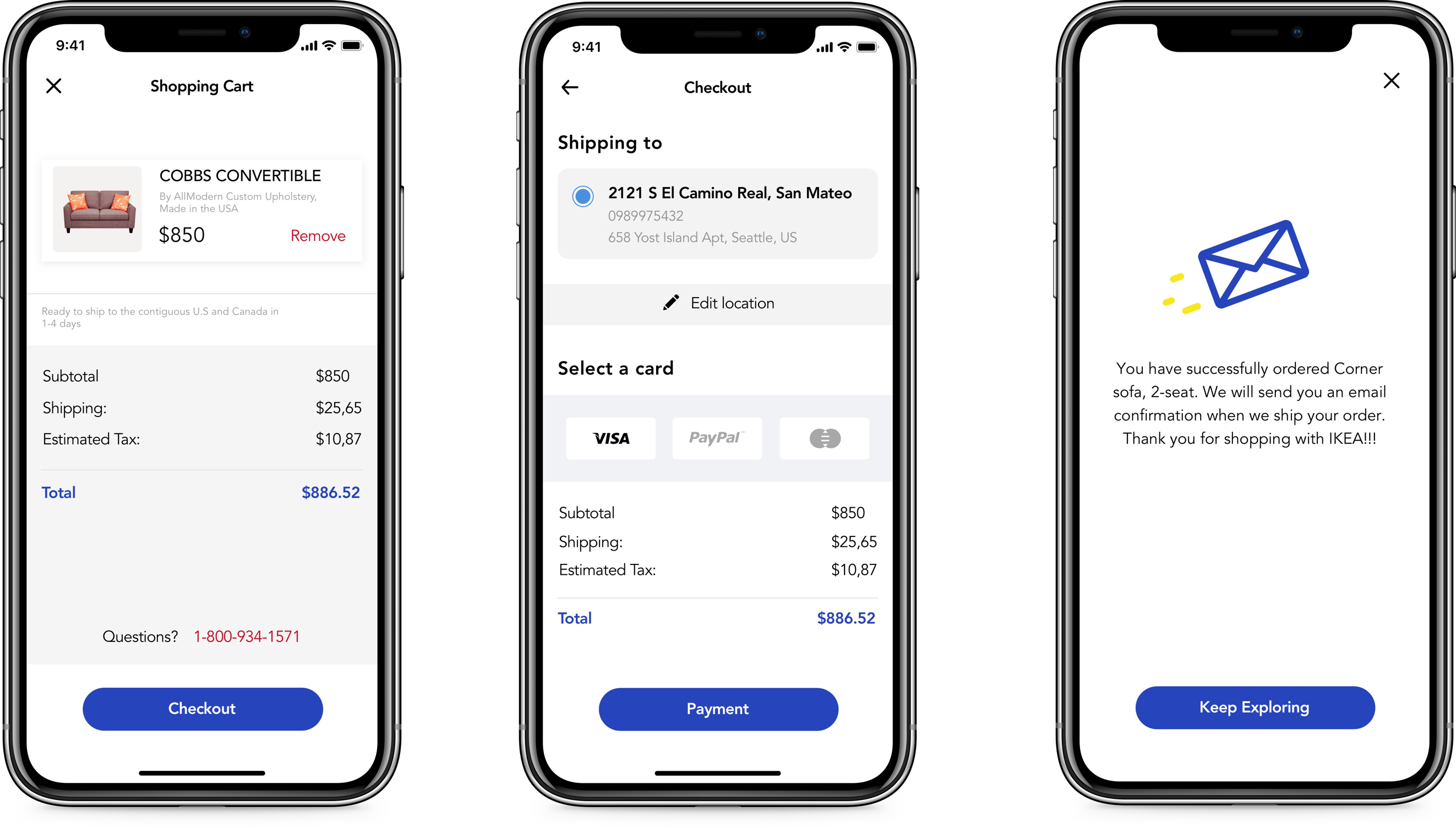
The most frequently asked feature from the interviewers. People want to purchase using the IKEA App. I designed this check-out flow. Users can add their favorite furniture to the shopping cart. Also, they can see the price after tax. They can select the payment method and edit the shipping address. After tapping the Place the order CTA button, the app will show a confirmation screen to let users know they successfully order the item.
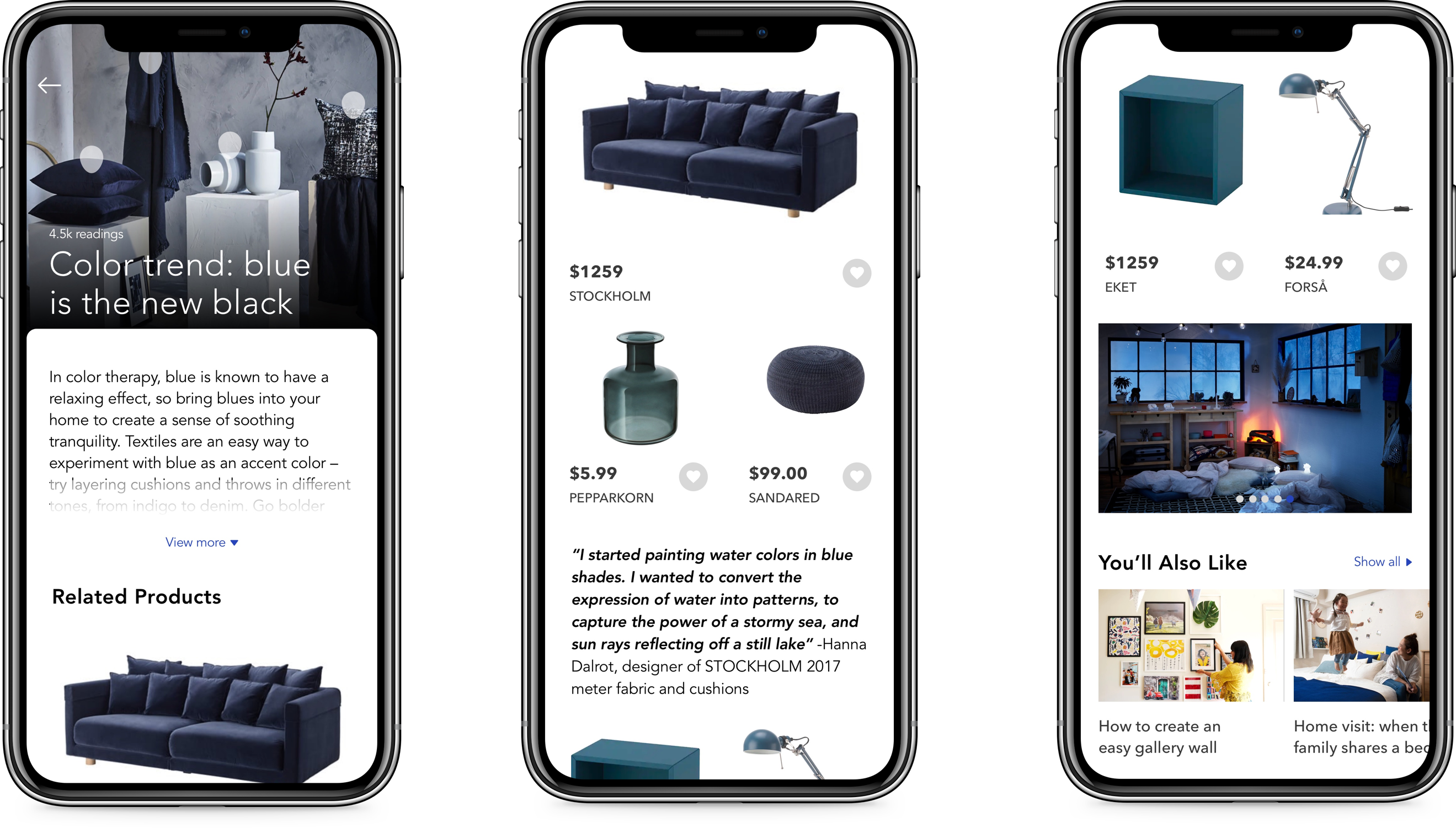
Through the interviews, I found out that some users had difficulty to find the furniture. Not only the current searching experience is not intuitive, but also because they do not get their inspiration. Not everyone knows how to decorate their homes. So it is important to give users their inspiration. So I design a feature called “Ikea Ideas.” Users can browse all the ideas in the feed, e.g., Decorate your room with blue furniture. Users can read the article and see the mentioned furniture at the bottom. They can follow the idea of purchasing the furniture.

Use search banner to search the queen size bed frame, then add the “Best Seller” one to wish list.


Use IKEA Ideas feature to read “Color trend: blue is the new black” article and tap blue sofa image to view the detail page.


View “Shop by new products” and purchase a new couch.

Use search banner to search the queen size bed frame, then add the “Best Seller” one to wish list.
Use IKEA Ideas feature to read “Color trend: blue is the new black” article and tap blue sofa image to view the detail page.
View “Shop by new products” and purchase a new couch.
Validating the designs through User Testing is very important to make the right improvements. From low-fidelity wireframes to high-fidelity design, every change has made from feedback from the testing with users. Through repeat testing, the prototype has changed a lot to smooth the user flow and improve the experience.
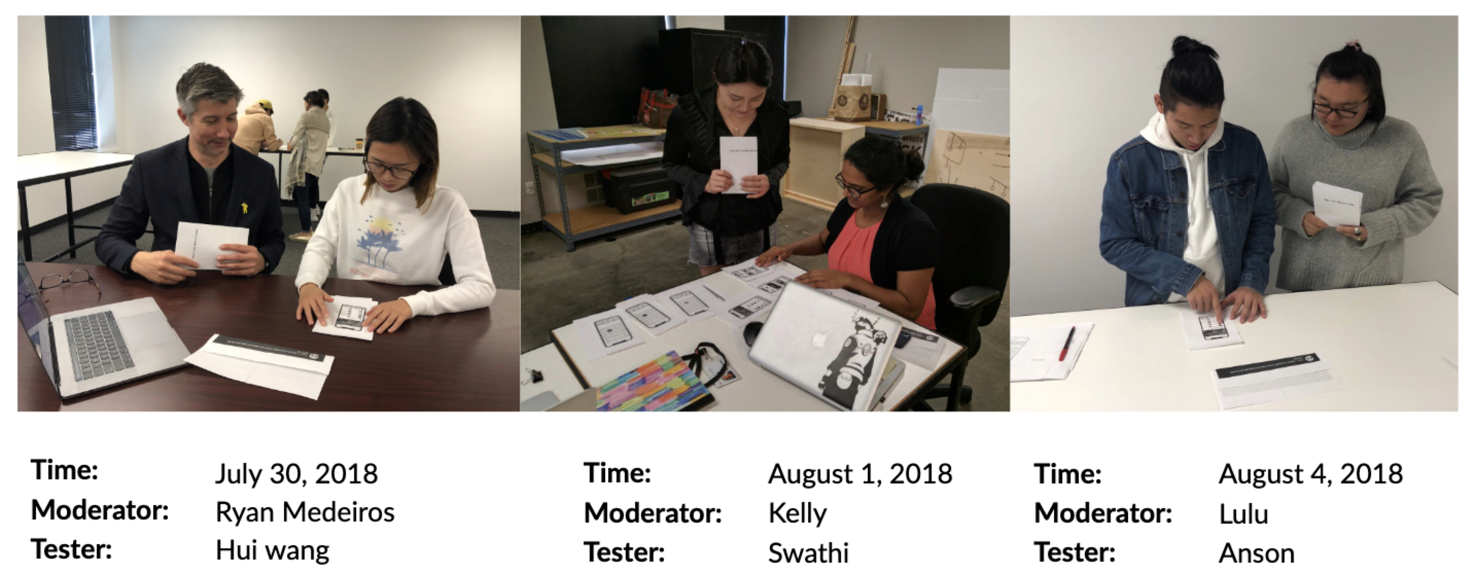
I did user testing with 18 people to use the current and the redesigned IKEA home-screen (InVision Prototype). All of them think the redesigned home-screen is a big improvement in terms of information hierarchy. They can easily explore furniture through the Department, IKEA Ideas, New Product, and Sales. 90% of people think visually is more modern and appealing.
.png)
All interviewers think check-out flow is a must feature for IKEA App. The current IKEA App doesn’t support check-out function and tell users up-front. Some users spend 1 hour explore the furniture and then figure out they cannot order the products. It causes a lot of compliance. I added the check-out function and tested the prototype with 18 people. 17 out of 18 people successfully order the furniture and think it is easy to use.
.png)
For the "Search result screen," I add a filter icon on the top. For example, if you search "Bed Frame," it will show several filter options like single, twin, queen, and king. So users can easily select the size. For the layout, I put two products in a row so that it can display more products on one screen, especially on a smaller size device. Also, I add a "Best Seller" label, so users can know which one is the most popular. 15 out of 18 users think the redesigned screen is more user-friendly.
.png)


View More Products